The bootcar model is used to implement a carousel based on the bootstrap framework. A carousel normally involves a series of sliding images which the user may be allowed to navigate using icons that overlay the carousel. Background images may be supplemented with text overlays or you can also have a text-only carousel without background images.
Defining Images
Prior to using the bootcar model, if you require background images for your carousel you will need to define these in advance. Although it is not a strict requirement, you will find that the carousel will look and behave better if you define all of your images to be the same size. If your carousel shows large images, you should consider defining multiple image sizes for each image definition and specifying an image_sizes definition so that the browser can load smaller images for users who are browsing on phones and other small devices.
The bootcar model is capable of looking up textual content from each image in the carousel. For example, you can define some extended properties, such as *short-description and *long-description, on the image and present this information within the carousel overlays.
Sample Carousel
This help will describe the process of creating the following sample carousel.

Next to each image we want to show some wording associated with the picture. For this example we have decided to store this information using the *short-description property of each image as we see here:

Defining the Carousel Contents
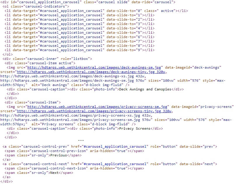
Here we see the definition for the carousel shown above.

Let's review the values we have assigned.
Include Prev/Next
Notice on the carousel depicted above there is a subtle left-arrow on the picture and right arrow on the right side of the carousel. These icons allow the user to scroll to the next and previous slide. Check the Include Prev/Next option to support this feature. By default, these arrows are white, you can make these black by carousel-dark to the carousel outer div as shown here:

Include Indicators
Referring back to the carousel image, notice there are several short lines at the bottom of the carousel. These are used to show the user how many slides are in the carousel and also which slide is currently in view. The user can also click on one of the lines to navigate directly to a certain slide.
Auto Play
Choose this option if you want the carousel to advance through the slides automatically once the page is loaded.
Shift Interval
This controls the speed by which the slides advance. If you don't adjust this setting, the slides will shift about every 5 seconds. You can shorten this to every second by moving the slider slightly to the right. If you move the slider all the way to the right, the slides will advance every 40 seconds.
Supplemental CSS
Here is the CSS shown in the example above:
.photo-info {padding:.2em;max-width:10em;margin:auto; font-weight:bold}
@media only screen and (min-width:1200px)
{
.photo-info  {padding:.5em;float:right; font-size:200%; background-color:black; margin-bottom:4em}
}
Custom style definitions can be added here if they are not already defined within an external style sheet. Here we define some styles to show the content which will overlay each image. On small devices we centre the overlay on top of the images. On wider devices, we float the overlay to the right of the images.
Template Content
The content entered here will overlay the images. Since we want this content to change for each image we are using a special placeholder called $imageproperty(*short-description). This will be substituted for the *short-description property associated with each image. We can use $imageproperty several times in this content if we wish to show other image properties as well. Note that $imageproperty is not an "official' dollar function. It can only be used in the context of this overlay.
In addition to using $imageproperty, which pulls textual content from the background images, you can also use the special placeholder :overlay_content:. In such a case, this placeholder will be substituted with the content entered next to the image in the Overlay Content column.
Occasionally, you may want to define a template to handle most of the carousel items while also having the option to override the template for certain items. This can be done by prefixing the Overlay Content with !. Here we show an example of a template that uses both $imageproperty and :overlay_content: placeholders. The third item of the carousel won't use this template since its content begins with !.

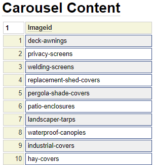
Carousel Content
The first column of the carousel content reflects the list of images you wish to navigate. Notice that these image fields have a blue box around them. This tells you that you can double-click on this field to pull up a list of images from which to select. Before double-clicking on the first image you should insert enough rows needed to select all of the images that you want to include in the carousel.
The next column can be used to overlay content over one or more images. If this overlay content is provided, it will override the default content specified within the Template Content field described above. $imageproperty cannot be used here and is not needed since you can have a different overlay for each image.
If you want to create a slide carousel that does not show images, you could simply clear an "empty" image definition. That is, define a white image or one with the background colour you want for your slides. This same image definition could be used on each row and column two would contain the content of each slide.
Class Overrides
When rendering the carousel various default classes are used to obtain the desired effects. This grid allows you to override or supplement the various classes that are rendered.

By default, the classes you enter will be used in addition to the default classes. Click on the override column check box to replace the default classes with the ones you provided.
Note that it is necessary for you to define these class definitions (CSS formatting) either locally or within an external stylesheet.
Rendering the Carousel
After stowing the carousel under the desired name this can be rendered on any page (or within your layout) by using the $bootcar function. This function takes exactly one parameter, that being the name of the carousel you want to render. On our sample page we have decided to place the carousel within the preamble section styles with a silver background as shown here.

In order for the carousel to render properly you must ensure that you have loaded the necessary bootstrap styles and script. Normally this will be done by setting the bootstrap package within site_settings. If all of your pages don't require bootstrap, you can also set the bootstrap package at the layout or page level.