Overview
The bootgrid model creates pages intended to show information laid out within a grid system. This model relies on styles that are defined as part of the Bootstrap 5 framework. Before using this model, we recommend that you first visit the following link to become familiar with the Bootstrap Grid System.
The concept of a grid is similar to that of an html table and, as such, this model is used in a manner similar to the table model. The advantage of grids over tables is that they can be more responsive to changes in the screen width so grids make it easier to build responsive sites that are adapt to different devices.
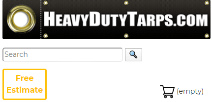
It is important to note that this model can play a role in helping to lay out your screens even in cases where you are not dealing with a traditional uniform grid pattern. For example, the bootgrid model can help you space out a banner such as the one shown here:

Here we see the same banner after the user has resized the screen to reduce the available width:
The rows you use on this model correspond to rows within the bootstrap grid container. The cells of the model correspond to columns within the grid. Grid containers can can be nested by including $page functions that refer to other tables. Properties can be assigned to rows, columns and cells to set styling or to control the width of a cell.
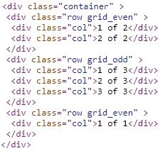
Here is some sample HTML that could be generated by the bootgrid model.
<div class="container" >
<div class="row grid_head">
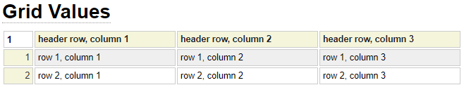
<div class="col">header row, column 1</div>
<div class="col">header row, column 2</div>
<div class="col">header row, column 3</div>
</div>
<div class="row grid_even">
<div class="col">row 1, column 1</div>
<div class="col">row 1, column 2</div>
<div class="col">row 1, column 3</div>
</div>
<div class="row grid_odd">
<div class="col">row 2, column 1</div>
<div class="col">row 2, column 2</div>
<div class="col">row 2, column 3</div>
</div>
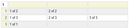
</div>In this case, the specification is very simple with no class overrides indicated. We can see that the default class for the outside div tag is container. row is the default class for each row and col is the default class for reach column (cell).
Additionally, the header row (if used) has an additional default class called grid_head, the default class on the other rows alternate between grid_even and grid_odd. Here is the grid specification used to generate the above html:
bootgrid Parameters
Let's review some of the other parameters that can be used to control the appearance of the grid.
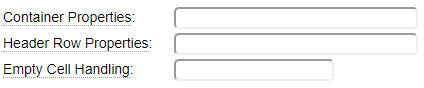
Container Properties
Use this field to set properties of the outer div tag used to contain the grid. On rare occasions you may not want an outer container div to be generated, perhaps if the grid is being embedded inside another tag that serves as a container. In such a case, enter ! in the container properties. This tells the runtime not to generate an outer div for the grid. Any other properties that you enter will be merged with the class="container" property that is generated by default.
Header Row Properties
If your grid contains a header row, you can use this field to override the default properties of the div tag used to contain the header row. The default property for this row is class="grid_head".
Empty Cell Handling
By default, cells left empty will be ignored. For example, if you leave a cell in column 1 empty and enter a value in the adjacent cell in column 2, the value will actually end up in column 1 of the rendered grid. If you don't want this behaviour you could enter a into the cell. This default behaviour can be changed by setting the Empty Cell Handling property to one of these values:
colspan
When a cell is followed by one or more empty cells (to the right), a class="col-x" property will be added to the cell to "consume" the x-1 empty cells to the right.
empty
Use this value to force empty cells to be rendered as empty cells in the generated grid.
nbsp
Use this setting to automatically populate empty cells with a non-breaking space to force these columns to be rendered.
=value
If this option contains a value that begins with an equal sign, the specified value (after the equal sign) will be automatically placed in the empty cells when the grid is rendered.
Header Row
The first row of the grid is used to define a header row. Leave this row empty if you don't require any special formatting for the first row of the resulting bootstrap grid.
Row Properties
To enter the properties of a grid row, click on the row number then click on the three dots to bring up the row menu. Note that when you click on the last row of the grid, the three dots may not be visible, in such a case use your mouse track wheel to scroll down to bring the dots into view (or use the scroll bar to the right if you don't have a track wheel). After clicking the icon you should see the row options.
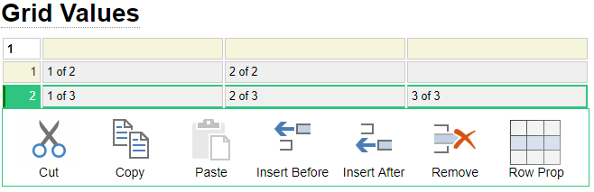
The last icon on the right is used to specify row properties. Click the icon then enter the properties and click OK. The properties you enter here will be merged with the default properties for the row.
It is possible to define certain rows that are not to be wrapped in row and col div tags. This can be done by setting the row properties for the row to the value "none".
Column Properties
To enter column properties follow a similar procedure to what is described above for adding row properties except rather than clicking on a row number you start by clicking on a column heading. When the three dots appear, click these then click the Column Properties Icon. The properties you apply to the column will be automatically propagated to all of the cells within this column unless this same property is indicated at the cell level. For example, if you specify class="special-column" at the column level, each cell in this column will be supplemented by this class unless the cell has specifically set an alternate class value.
Cell Properties
To enter cell properties, click the beginning of the cell for which you want to add properties. Under Chrome you will need to click twice (slowly so that it is not treated as a double-click). Then hold down the Ctrl key then press the Enter key. You should be presented with a popup window where you can enter the cell properties. The default cell property is class="col" (or class="col-x" if the colspan option is set and the cell needs to span multiple columns.) If you explicitly specify a class that begins with "col", this will override the default col class. On the other hand, if you specify a class that does not begin with col, this will supplement the default col class.
Property Indicators
When properties have been added to a cell or a row, you will notice that the cells are given special styling to alert you to the fact that the cells have been styled. In the following image, the green borders tell us that properties have been added to:
- Column 2 (this styles all of the cells in column 2)
- Row 2 (this styles the div tag used to define row 2)
- Row number 3, column 1 (this styles or adds properties to a specific div for this row and column)
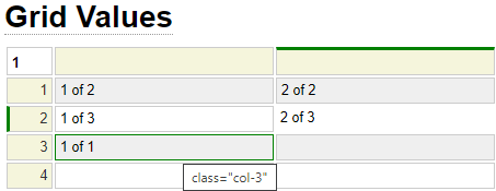
If you hover your cursor over a cell with a green indicator you will be shown the properties that have been assigned to the cell.