The boottab model is used to render pages containing a tabbed control utilizing styles from the bootstrap framework.
Here we see an example of a generated tab control.

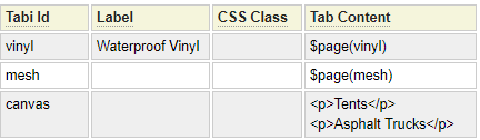
Here is the definition used to create the output above.

Tab Id
The tab id refers to the unique identifier that will be associated with the tab. This should only contain lowercase letters and number as well as underscores or dashes.
Label
The label text will be shown on the tab as anchor text. If left blank, the label text will be defaulted by converting the Tab Id into words by changing underscores and dashes to spaces and making each word title case.
CSS Class
This can be used to add one or more css class identifiers to style the tab content. Note that you are also able to set classes that apply to all tabs, this css class setting should only be used for classes that are specific to certain tabs.
Tab Content
The content of each tab can be entered directly as is shown on the canvas tab above or it can reference other content using dollar functions. Static content can also be intermingled with dollar function content.
Tab Styles
The Tab Style selector allows you to choose between normal (shown above), and Pill styles. Here we see an example of the Pill style tabs:

Here is an example of Vertical Pill style:

Custom Styling
These fields can be used to add custom classes to style the tabs as needed.

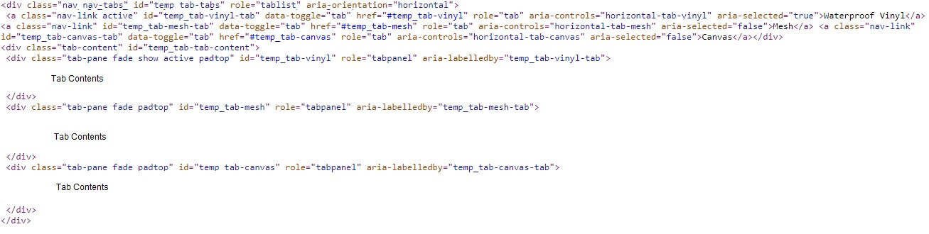
Here we show the structure of the HTML used to render the tab control. The bolded class names reflect the classes that are entered in the corresponding fields above.
<div class="nav nav-tabs TAB-OUTER-CLASS" id="temp_tab-tabs" role="tablist" aria-orientation="horizontal">
 <a class="nav-link active TAB-INNER-CLASS" id="temp_tab-vinyl-tab" data-toggle="tab" href="#temp_tab-vinyl" role="tab"
   aria-controls="horizontal-tab-vinyl" aria-selected="true">Waterproof Vinyl</a>
 <a class="nav-link TAB-INNER-CLASS" id="temp_tab-mesh-tab" data-toggle="tab" href="#temp_tab-mesh" role="tab"
   aria-controls="horizontal-tab-mesh" aria-selected="false">Mesh</a>
 <a class="nav-link TAB-INNER-CLASS" id="temp_tab-canvas-tab" data-toggle="tab" href="#temp_tab-canvas" role="tab"
   aria-controls="horizontal-tab-canvas" aria-selected="false">Canvas</a>
</div>
<div class="tab-content CONTENT-OUTER-CLASS" id="temp_tab-tab-content">
 <div class="tab-pane fade show active CONTENT-INNER-CLASS" id="temp_tab-vinyl" role="tabpanel" aria-labelledby="temp_tab-vinyl-tab">
  	tab 1 content
 </div>
 <div class="tab-pane fade CONTENT-INNER-CLASS" id="temp_tab-mesh" role="tabpanel" aria-labelledby="temp_tab-mesh-tab">
  	tab 2 content
 </div>
 <div class="tab-pane fade CONTENT-INNER-CLASS" id="temp_tab-canvas" role="tabpanel" aria-labelledby="temp_tab-canvas-tab">
  	tab 3 content
 </div>
</div>
The css classes you enter can either be defined in the local styles section or within a linked css file.
Creating Tabbed Forms
The boottab model can be combined with the form model to create tabbed forms as shown here:

To do this, use the form model several times to create each tab individually as Page Components.
Add these pages to the boottab definition as shown below:

The boottab definition will also be stowed as type Page Component.
Finally, create the "master" form which includes the boottab page component as well as any other common form content such as navigation links as we see here.