The flexgrid model is used to configure a complex input control that allows users to edit a set data values defined in a series of rows and columns much like a spreadsheet. Internally, flexgrid controls are rendered as html contenteditable tables and are supported by a hidden field that contains xml data that is used to configure the control and house the data to appear in the flexgrid.
Most of the parameters supplied to the flexgrid model configure the appearance and behaviour of the flexgrid. Let's review these parameters now.
Flexgrid Description
This description is used in messages that refer to the flexgrid control. Enter one or two words to identify the flexgrid to users.
Namespace
If the generated flexgrid class is to be defined within a certain namespace enter it here. This is normally only used when you wish to inherit flexgrids from other sites.
Table Class
This css class name will be added to the rendered table. This can be used to style the flexgrid.
Table Height
If the rendered table is to have a fixed height, choose the desired height here. When a height is given, the table will occupy the same height regardless of the number of rows defined in the grid. When the number of rows exceeds what can be shown within the specified height, a scrollbar will be introduced to allow the user to scroll to the rows which are not visible. Use auto if you want the height of the table to grow based on the number of rows that are defined.
Column Properties
This field can be assigned the name of a css class that will be used to style the flexgrid columns.
Row Properties
This field can be assigned the name of a css class that will be used to style the flexgrid rows.
TD Properties
This field can be assigned the name of a css class that will be used to style the flexgrid cells.
Translation Class
If you wish to externalize and/or translate the grid column headings, enter the name of a definition created using the translation model. Inside this definition, column one should define the column names to be translated. Here we see a translation definition used to translate a flexgrid containing five columns named tag, property, contents, leave_open and device.

The Label value will be used to supply the column headings in the flexgrid. Since this translation defines info_head and info_body, these will be used to drop down an infobox on the heading values.
Column Configuration
Fixed Columns
Flexgrids allow a certain number of fixed columns optionally followed by variable columns (which the user can insert and delete). Enter the number of leading (left hand side) columns that are fixed.
Initial Columns
Indicate how many columns should be shown by default. This value must be greater than or equal to the number of fixed columns.
Insert Columns
If the user is allowed to insert new columns check this option.
Default Column Width
Column widths can be defined at the column level. Use this value to designate a default width for columns that do not specify a width.
Key Format
Optionally, one of the columns in the flexgrid can be designated as a key column. In such a case, the Key Format field can be used to specify a regular expression that will be used to validate the format of the key. By default, the key must start with a letter (uppercase or lowercase) followed by letters, numbers or underscore. That is, the default regular expression is /^[A-Za-z][A-Za-z0-9_]*$/.
Row Configuration
Updatable Heading Row
Check this option if you want to allow the user to enter values into the heading row of the flexgrid by default. This value can be overridden at the flexgrid column level.
Fixed Rows
If the flexgrid must define a certain number of fixed rows, enter the desired number here. The user will not be able to delete this number of leading fixed rows.
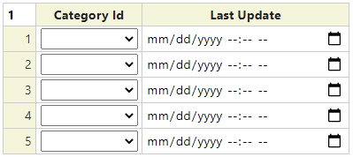
Initial Rows
Enter the number of rows to be shown in the flexgrid by default.
Required Rows
If a certain number of rows are required, enter the number here. If the user has not entered at least this many rows, a validation error will be triggered.
Allow Insert Rows
Check this option if the user is allowed to insert new rows into the flexgrid.
th Row Class
If specified, this css class will be assigned to the table heading cells by default. This value can be overridden at the column level.
td Row Class
If specified, this css class will be assigned to the table data cells by default. This value can be overridden at the column level.
Configuring the Flexgrid Columns
The Column Details grid will normally have one row for each column to be shown in the rendered flexgrid. In this section we describe the fields used to configure each column.
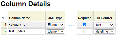
Column Name
Enter the internal name of the column. This must begin with a lowercase letter followed by lowercase letters, numbers or underscores. If this column can be inserted dynamically, enter the column name new().
XML Type
This is used to indicate how the column will be represented in the rendered XML. Select Key if the column must be unique. Only one column can be designated as a key. Generally, short "code" values are represented as attributes whereas longer values are represented as elements.
Heading UI Control
If the heading is to be implemented as an input control (as opposed to a simple text string), select the name of the control to be used.
Heading or UI Parms
If the heading in implemented as an input control, this field can be used to supply parameters to configure the control. If the heading is not implemented as a UI control, use this column to enter the heading itself. Note that, if your flexgrid uses a translation class, the heading text will be taken from there.
Translation Class
If you wish to override the default Translation Class for certain columns, you can specify an alternate translation class here.
No Infobox
Check this option if you do not want the column to support a drop down information box on the column heading to instruct the user as to the purpose of the column.
Column Width
If you don't want certain columns to inherit the default width, enter the desired width here.
Alignment
Select the desired alignment for the contents of the column.
th Class
This field can be used to override the default css class to be used for the column heading cell.
td Class
This field can be used to override the default css class to be used for the data cells of the column.
Initial Value
If the column is to have a default value, enter it here.
Required
If this column value must be supplied for every row, check this option. Note that key columns are required by default.
UI Control
If the column values are to be entered using an input (User Interface) control, select the desired control to be used. If no control is indicated, the user will be able to type directly into the table cell.
UI Parameters
If a UI Control is indicated, this field can be used to supply parameters to configure the control.
Protected
Select this option if the column values are to be protected (read only) by default.
Editable Heading
Select this option to override the default setting to indicate whether the user can over type the column heading value.
Validations
Validators can be written to implement complex validation for flexgrid column values. To learn more about validators please follow this link.
Sortable
This property is not yet implemented by will be used to indicate that client side sorting of the column is supported.
Adding a flexgrid to a Form
To add a flexgrid to a form code the following syntax:
:field_name,type:flexgrid
This assumes that the name of the field matches that of the flexgrid class to be used. If this is not the case, you must also include the parameter *flexgrid to identify the desired flexgrid class. For example:
:field1,type:flexgrid,*flexgrid:my_flexgrid
Hiding Flexgrids by Default
Sometimes flexgrids are used to show optional information and you may want to hide the flexgrid if it does not contain any information. This can be done by adding a *summary property as in:
:field_name,type:flexgrid,*summary:Optional Settings
If you want to show flexgrids that do not contain any information but allow the user to hide the flexgrid sent the *open property to true.
Interacting With Flexgrids
Flexgrids are implemented as php classes. To read and write flexgrid column and row values you must instantiate a flexgrid object and call its methods.
Instantiating a Flexgrid Object
The following code can be used to instantiate a flexgrid object defined as my_flexgrid.
$flexgrid_obj = $this->site->create_object('my_flexgrid','',false,'flexgrid');
$flexgrid_obj->initialize();
Loading a Grid from XML
$loaded = $flexgrid_object->load_spec_row_from_flexgrid_xml($xml,$validate);Please refer to the class db_object_form_handler_base in the system site under classes/form_handler for examples of interacting with a flexgrid.
Credits
The flexgrid control is based on the amazing work of Jos Huybrighs and we are very grateful to him for sharing the JavaScript code for his Flexible Table Editor.