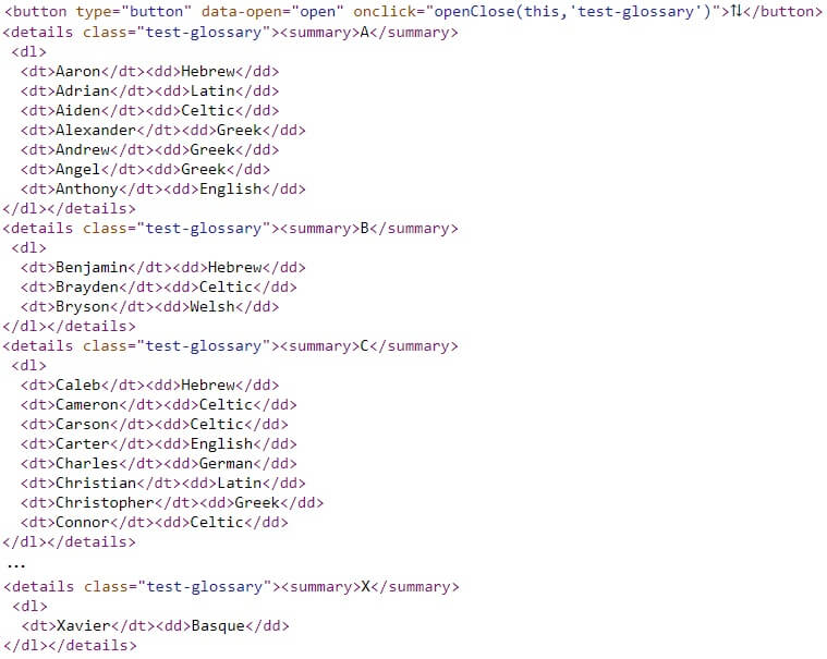
The glossary model is primarily used to build a page which defines a glossary of terms. Nevertheless, this model could be used to build any content that is best represented by a definition list. Options allow you to specify whether all definitions are to be revealed when the page is first rendered or if the user should render definitions by clicking on the starting letter of the definition. Here is an example of a rendered glossary page showing legal terms after the user has clicked on the letter G:

Control Properties
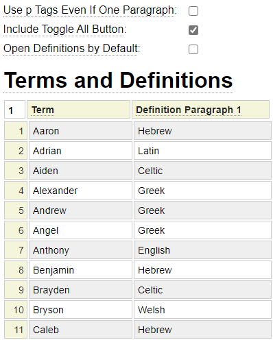
Here we see the checkboxes use to control the behavior of the page:

Use p Tags Even if One Paragraph
Definitions can consist of any number of paragraphs. When multiple paragraphs are entered, each paragraph is wrapped in an open and close p tag. Sometime you may want to use paragraph tags even for definitions that consist of a single paragraph. In such cases, choose this option.
Include Toggle All Button
Check this option if you want to include a toggle "gadget" that allow the user to open or close all definitions en masse to reveal or hide the definitions.
Open Definitions by Default
Normally the definitions are hidden until the user selects the starting letter to be revealed. Check this option to change the default behavior so that all definitions are shown when the page is first rendered.
Entering Terms and Definitions
The main grid is used to enter any number of definitions.

The terms to be defined should be entered into the first column in the order which they should appear. Terms will automatically be grouped according to the first letter of the term. The sort command can be used to sort the rows alphabetically by the term column.
The first paragraph of the definition should be entered into column two. If more paragraphs are required, click on the header of paragraph 2 to select the Insert After option which will insert more columns for entering additional paragraphs.