Overview
The image_sizes model is used to generate image size configurations used by the image model to support efficient responsive images utilizing the srcset feature of HTML 5. When building responsive sites that render images, the srcset option on the image tag allows the browser to download the most efficient image according to the user's viewport width. It should be noted, that the sizes option does not actually control the dimensions of the image that is rendered, this is handled by your CSS style settings. The sizes option only influences the efficient loading of images.
Image CSS
Since the sizes option of an img tag is normally strongly correlated to the CSS used by the image, we allow you to specify the CSS along with the sizes settings. Putting the CSS here will help to reduce the size of your external style sheets since these do not have to include the image styling for all of your images. Nevertheless, feel free to leave the Image CSS field empty if you prefer to style your images within a shared stylesheet.
Sizes Settings
The sizes settings are entered using a minimum of two rows. Each row defines a media condition and a size option. The last row reflects the default option when none of the media conditions are satisfied.
Example
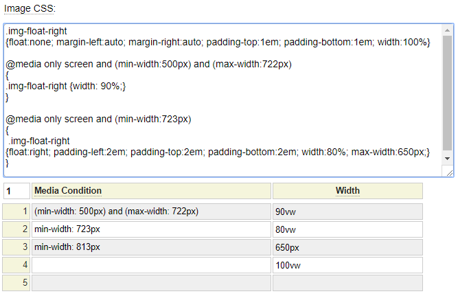
A common scenario for responsive image rendering is when you want an image to take up the entire screen with on narrow screens but on wider screens you want to float the image. Often you will allow the image to get larger on wider screens but only to a point. Consider the CSS and sizes settings shown to the right. Let's first review the CSS.
Example CSS
The objective of the CSS is to define the class img-float-right such that it is responsive to the screen width. We can use the following pseudo code to reflect the image width portion of this css as follows:
if (screen-width is between 500px and 722px)
{
   width: 90%;
}
elseif (screen-width is greater than 722px)
{
   width:80%; max-width:650px;
}
else
{
   width: 100%
}
Example Sizes
When entering the sizes definition, this is also based on media queries and these normally align with what is indicated in your css. The sizes are often relative to the browser's viewport width (indicated by vw). Viewport width is basically the width of the current browser window. We can represent the sizes using the following pseudo code:
if (screen-width is between 500px and 722px)
{
   Use the image that is close to 90% of the viewport width;
}
elseif (screen width is at least 723px)
{
   Use the image that is close to 80% of the viewport width;
}
elseif (screen width is at least 813px)
{
   Use the image that is close to 650px width;
}
else
{
   Use the image that is close to the viewport width
}
You may be wondering where the size 813 came from (since this is not mentioned in the CSS). Notice that the CSS indicates that after screen with 722px, the image should be 80% of the screen width but to a maximum of 650px. 80% of 813 is 650, therefore screen width 813 is the point where the image will stop growing, regardless of how wide the browser window becomes.
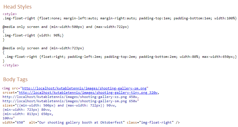
You can click on the image to the right to see the HTML that is generated by the sizes specification entered.
Recommendation
During the design of your site you often don't know exactly how "responsive" your images will be since this may depend on other content within your layout and what images you have to work with. Therefore, it may be more productive to defer the creation of multiple image sizes and the size definitions until late in the development process. Nevertheless, don't forget to perform this step since it can make a big difference in the performance of your site.