The imagegrid model is used to create a page (or page component) that renders a series of images responsively. Before using the imagegrid model you must first:
- Define your images using the image model.
- Define an image list using the imagelist model.
Please review the above links first if you have not yet created your image list.
Here we see a collection of images rendered using the imagegrid model.

One of the features of this model is that you can overlay the images when selected or in all cases. The images can also be linked to larger lightbox images or webpages.
Let's review how to implement the various features of this model.
Main Parameters
Most of the parameters to this model are optional and can be left empty if you do not require the feature supported by the parameter. In the following parameter list, only the imagelist id is required.

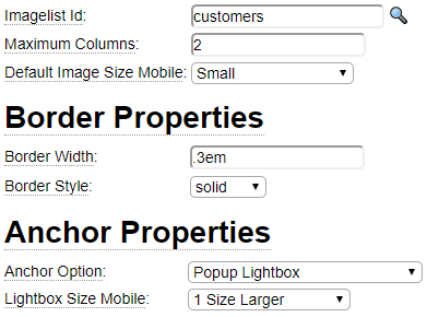
Imagelist Id
Enter the name of the imagelist defined using the imagelist model. You can click on the magnifying glass to select an imagelist.
Maximum Columns
Use this field to restrict the number of images to be shown on each row to this number.
Spacing
Normally, images will be rendered immediately next to each other. Use this field to add (left/right, top/bottom) spacing between each image. Any valid CSS unit can be used however ems are recommended for optimal cross-browser compatibility.
Default Image Sizes
When images are defined, it is possible to have up to seven separate images for each image definition ranging in size from tiny, xs (extra small), sm (small), md (medium), lg (large), xl (extra large) and huge. On the image definitions themselves it is possible to indicate a default image size to be rendered depending on the device. The default size settings on the imagegrid definition are used if you want to override the defaults specified at the image level. These values can be expressed in absolute terms or they can be made relative to the defaults set at the image level. For example, if the default mobile image size for a certain image is tiny, you could specify '1 size larger' in the imagegrid definition in order to make the mobile device show the xs version of the image.
Border Properties

The Border Properties are used to draw borders around each image in the grid. The Border Radius allows you to make rounded borders as opposed to rectangular borders.
Anchor Properties

The anchor properties are used to make images anchor links. Using this feature you can choose from two main events that can happen when users click on images of the grid:
- Clicking on an image can bring up a larger version of the image (or a different related image) using what's known as a lightbox to pop up the image.
- Clicking on an image can bring up a related web page or document such as a PDF.
Defining Larger Images (lightbox pop ups)
To use this feature, the images defined within the grid should be defined with multiple image sizes. Normally, the different images show the same content in different sizes however it is possible to define completely different images. For example, perhaps the tiny images could just be icons which provide hints to what will be shown when the user clicks the icon. You can specify a different pop up size for phone and desktop devices. These sizes can either be absolute (md, lg, etc.) or relative to the imagegrid size shown (1 size large, 2 sizes larger, etc.).
Linking to Pages and Documents
In order to link to pages and other documents, you must define the link information as properties of the image definitions. There are three different types of addresses that you can link to:
- Pages (or documents) within external sites
- Pages within the current site
- Documents within the current site
Let's review how each of these is configured using image properties.
Linking to External Pages and Documents
To link to external sites, an image should set the *href property to the url to be linked to. By default, external links open in a new browser tab however, the image can set the *target property to _self to indicate that the site should open up in the current tab/window.
Linking to Internal Pages
To link to a page on the current site, the image should set the *page property to the name of the page to be loaded. Additionally, the image can set the *page-parms property in order to pass parameters to the page via the querystring.
Linking to documents on the current site
To link to a document (pdf, image, xml file etc.) set the *mysite-document to the name of the document to be loaded. For example, to link to a pdf in the docs folder you would enter docs/pdfname.pdf. Normally these will open in a new window however you can set the *target property to override this.
CSS Properties

The imagegrid model attempts to generate suitable CSS to ensure the images within the grid are responsive and to show the desired number of images (abreast) at various screen widths. Occasionally you may need to supplement the CSS that is generated by default or even replace this CSS with styling that you have coded by hand. Use the CSS properties field for this purpose and indicate whether the CSS you have provided is to supplement or replace the CSS that is normally generated.
Media Widths
The Media Widths grid controls the generation of CSS Media Queries and image srcsets that are used to control the loading and sizing of images at various break points (screen widths). Each row reflects a different number of images that can be shown abreast at various screen widths. Note that if you have indicated a Maximum Columns value above, only this many rows of the table will be considered.

Column one is output only and cannot be changed, however you can add more rows if you want to allow more than 7 images abreast. In column two, enter the maximum screen width at which the specified number of image columns should be shown.
Columns three and four are used to facilitate the generation of scrset options for the rendered images. If you have other media queries that introduce columns at various screen widths indicate that here. For example, suppose your site design includes media queries that dedicate 20% of the screen to a right panel once the screen is more than 37.5em wide and introduces a fixed column that is 12em width when the screen width is above 62.5ems. We see above how the Media Width table accounts for screen area that is not available to the image grid. Columns three and four only apply if your image definitions include multiple images (of different sizes) and you have chosen the Calculate option (see below). The imagegrid page uses this information to generate CSS and srcset options to style the images at various points and advise the browser when to load certain image (sizes).
Sizes Setting on img Tags

The Sizes options only apply to image definitions that contain more than one (size of) image and is used to add the srcset property to your img tags. This can be set to one of the following values:
- Calculate is used to calculate the srcset sizes based on the Media Widths data entered above.
- To provide a custom imagesizes definition, create the definition using the imagesizes model then enter the name of the definition within the Explicit Sizes field and change the Sizes Option to "Use Supplied Value".
- The final option is to use the imagesizes that are referenced on the image definitions themselves.
Hover Overlay Properties
The hover properties are used to overlay the images when the user hovers the cursor over each image.

You have the option of overlaying the image with a page created by one of the other models or with simple text. In either case you can choose from several different overlay effects.
To overlay the image using a Template Page, use a page oriented model such as bootgrid, table, tags, etc. to design your page. Alternatively, simply design your page locally using the Hover Overlay Text field. In both cases your template text should contain placeholders that will be substituted using image properties. In the example above, we see that the overlay will include the image alt tag and the *short-description text. Be sure to bracket these placeholders with colons when building your template. It is also necessary to list all of the property names defined within your template within the Property Name grid. Add more rows if needed.