The swiper model supports the third party open source Swiper. Although the slider is very powerful, learning how to compose the JavaScript necessary to configure the slider can be challenging. The swiper model handles this for you by exposing various Swiper features using fill-in-the-blanks fields.
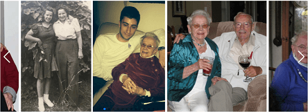
Here we see a sample of the Swiper Slider:

One of the features of the Swiper Slider is that users can manually swipe the images (using a mouse or touch screen) to navigate left and right. Before diving into this help page we suggest you first familiarize yourself with the Swiper features by clicking on the link above.
Rendering Your Swiper Slider
Once you have configured and stowed your swiper definition by setting the parameters set out below you can render this swiper on any page or within your layout by using the $swiper function. This function only takes one parameter, that is, the name of the swiper definition to be rendered.
Defining Your Images
Use the image model to define all of the images to be added to your slider.
Compiling Your Images
Use the imagelist model to assemble the images to appear on your slider in the desired order.
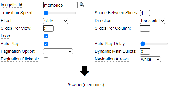
Configuring Swiper
Here we see the main properties of the swiper model:

Most of these properties are self explanatory. As with other models you can hover over the property label for a short description of each property.
Experiment with the Effect drop down to see the various slide transition options.
Pagination Options can be used to add bullets or slide numbers to the bottom of each slide to give users information about the number of slides and to allow easy navigation between slides. Here we see a bullet example:

Here see see that navigation arrows can also be added to the leftmost and rightmost slides:

Non-responsive Slide Settings
By default, the swiper slider will be responsive and automatically adapt the size of the slider to the width of its container. Alternatively, you can implement an adaptive design whereby a fixed image size is used on mobile devices and a different fixed size is used on desktop devices.
Anchor Properties
Anchor properties allow you to take certain action when the user clicks on one of the images in the slider. There are two main behaviours that are possible:
- Open a larger version on the selected image using a lightbox overlay
- Link to another page or document
For the first option you can indicate the size of the image to be popped up. This can be expressed as an absolute size or it can be relative to the size of the image shown in the swiper. The size you choose should be defined among the list of images saved for the specified image otherwise the closest available image size will be used.
Linking to Other Pages and Documents
To link to other pages and documents you must specify one of the following three attributes on the images in your slider.
*page
To link to a page in the current site, enter the name of the page in the *page property of the image. You can optionally specify the *page-parms property to pass parameters to the page on the query string.
*mysite-document
To link to a PDF or image within the current site enter the path to the document using the *mysite-document property. For example, docs/spec-sheet.doc
*href
To link to another website, add a *href property to the image and set this to the URL of the website to be linked to.
In all linking examples you have the option of opening the linked pages in the current window on on a new tab. This can vary by image by using the target property of the image. Use a target value of _blank to open the linked page in a new tab.
CSS Options
The CSS options allow you to tweak or override the default CSS that is generated.
Supplementary Classes
Use the Supplementary Classes grid to add additional CSS class names to the various containers that are used to build the slider.
Maximum Height
The Maximum Height field can be used to restrict the total height of the slider. Be sure to include the desired units, for example, enter 10em to limit the height to a maximum of 10ems.
Supplementary CSS
Additional hand-coded CSS can be added here to define the supplementary classes you have provided, assuming these classes are not already defined in the containing page or site stylesheets.
CSS Generation Options
Use this drop down to indicate whether the Supplementary CSS you have coded is intended to replace the default CSS generated by the swiper handler or whether this is intended to be additional CSS to supplement the default CSS.
Breakpoint Properties
Breakpoint Properties are intended to allow you to make certain settings responsive to the screen width. For example, you can configure the swiper slider to have fewer concurrently visible slides on smaller devices such as phones and more on larger devices.
Here we see an example the Breakpoint Properties grid:

Notice that there is an empty column shown to the right of the Space Between Slides column. This can be used to set other properties at certain break points. In this example we also adjust the slidesPerGroup property at each breakpoint:

You can insert additional columns into the grid to set other properties that are permitted to be set responsively at various breakpoints.
Overlay Properties
Overlay Properties are used to overlay the slides with content. The content comes from properties of the images in the slider. In this example, we will overlay the alt property of each image onto the center of the image:

Notice that the Overlay Text can contain any static text or HTML you want as well as property values encased in colon (:) characters. Here we are showing the alt tag of the image as a white overlay. You must list all of the overlay placeholders that you have used in the Overlay Property Name grid. The end result will be something like this:

If your images contain a mixture of light and dark photos you will likely want to add a background to the overlay so that the text is readable on all images. Otherwise poor contrast on certain images may make the text difficult to read.
If you need a more sophisticated or complex overlay you can define the overlay using any of the page oriented models such as tags or table. Then enter the name of the page in the Overlay Template Page field. Just make sure the page you define includes the placeholders you want to substitute using image properties. Of course these properties can include pseudo properties such as :*long-description: or other properties defined for the purpose of the overlay.
Advanced Properties
The Advanced Properties grid allows you to set any other properties that are supported by the swiper slider. Refer to the swiper documentation to see what properties are available. In this example we set one boolean property and one numeric property.