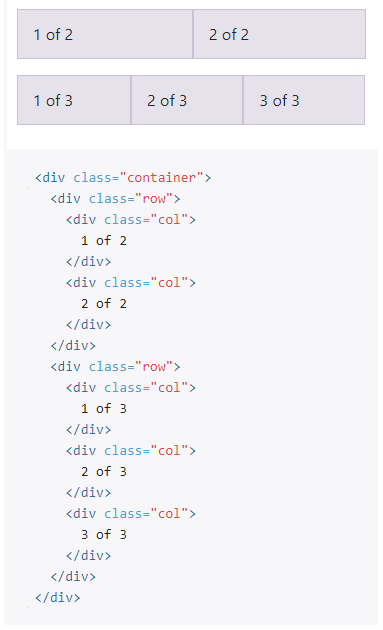
Bootstrap Grid Example
Consider the following Bootstrap Responsive Grid example copied from the Bootstrap website.
In GenHelm, the above HTML can be generated simply by entering the data values into the bootgrid model as shown here:
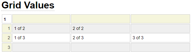
As with all models, you never maintain the actual HTML by hand. Maintenance is performed by adding and removing rows and columns by interacting with the visualized grid presented by the model.
Bootstrap Navbar Example
Here we show the extended version of a sample Bootstrap Navbar.

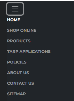
The Bootstrap framework takes care of collapsing this menu when the size of the window won't accommodate the expanded navbar. Here we see the collapsed version of the Navbar.
The problem is that you need a lot of intricate HTML to take advantage of Bootstrap's capabilities as we show below.
<nav class="navbar navbar-expand-xl navbar-dark bg-dark justify-content-end">
<div class="container-fluid">
  <button class="navbar-toggler navbar-toggler-right" type="button" data-bs-toggle="collapse" data-bs-target="#bootnav"
  	aria-controls="bootnav" aria-expanded="false" aria-label="Toggle navigation">
  	<span class="navbar-toggler-icon"></span>
 </button>
 <div class="collapse navbar-collapse" id="bootnav">
  <ul class="navbar-nav ">
   <li class="nav-item">
  	<a class="nav-link active" aria-current="page" title="Return to the home page"
  		href="https://www.heavydutytarps.com/">Home</a>
   </li>
   <li class="nav-item">
  	<a class="nav-link" title="View your shopping cart" href="https://www.heavydutytarps.com/shop">Shop Online</a>
   </li>
   <li class="nav-item">
  	<a class="nav-link" href="https://www.heavydutytarps.com/product-overview">Products</a>
   </li>
   <li class="nav-item">
  	<a class="nav-link" href="https://www.heavydutytarps.com/tarp-applications">Tarp Applications</a>
   </li>
   <li class="nav-item">
  	<a class="nav-link" href="https://www.heavydutytarps.com/policy-selector">Policies</a>
   </li>
   <li class="nav-item">
  	<a class="nav-link" href="https://www.heavydutytarps.com/about-us">About Us</a>
   </li>
   <li class="nav-item">
  	<a class="nav-link" href="https://www.heavydutytarps.com/contact-us">Contact Us</a>
   </li>
   <li class="nav-item">
  	<a class="nav-link" title="Visit our sitemap" href="https://www.heavydutytarps.com/sitemap">Sitemap</a>
   </li>
  </ul>
 </div>
</div>
</nav>
With GenHelm, you simply need to use the bootnav model to design your Navbar as shown here.
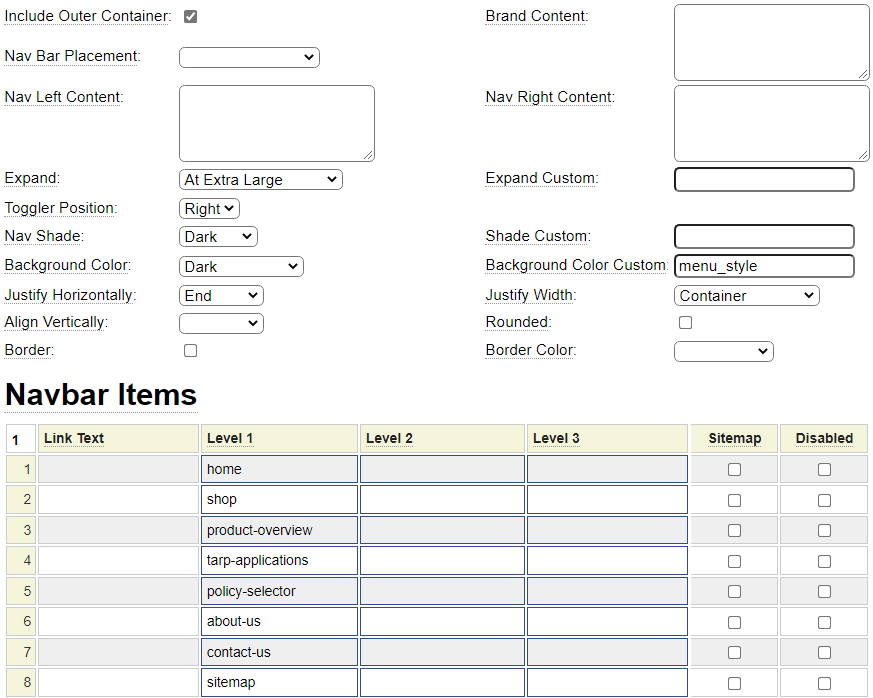
Once again you, as a web developer, never need to look at the actual HTML created by the GenHelm framework. Maintenance is performed by updating the information entered into the bootnav model.
Follow the links below to learn more about using GenHelm to build sites that leverage the Bootstrap framework.